|
Dear Fellow Investor,
Tom McClellan was last year’s No. 1 ranked Long-Term Stock Market Timer and No. 1 ranked Gold Timer.
So when he speaks, we listen.
I recently came across Tom’s thoughts on the Dow/Gold ratio and the extreme levels it’s reached. He provided a well-considered and valuable analysis in his article, and has graciously allowed us to present it here for you. (You can also view it on his web site here.)
— Brien Lundin
Chart In Focus:
DJIA/Gold Ratio
September 06, 2018
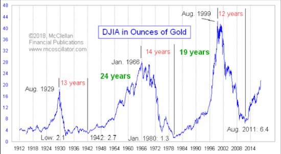
Every chart of price data is a depiction of a ratio. If you look at a chart of your favorite stock, what you are really looking at is the ratio of the value of your stock to the value of the dollar, since stock prices are quoted in dollars. AAPL recently was at 226 dollars per share. Gold recently is at 1200 dollars per ounce. Every price is a ratio.
But you don’t have to have currency in a ratio. The value of the DJIA is an approximation of dollars per something; I won’t discuss the merits of that index’s construction here. But if you take the DJIA’s “dollars per something” and compare it to gold’s “dollars per ounce”, you can factor out the currency and get a ratio of “something per ounce”. Again, don’t get me started on what the DJIA’s value means.
This week’s chart looks at the DJIA to gold ratio. Restating the units, what it shows is the value of the DJIA, measured in ounces of gold. What is interesting is that over a really long period of time, the boundaries of how far this ratio can go up or down tends to stay in a pretty consistent range. It is a hugely wide range, but it is consistent.
It is important to remember that for the first half of the chart, the price of gold was fixed by the U.S. government, first at $20.67/oz, and then it rose starting in 1933 to its eventual fix of $35/oz in 1935. Gold was only allowed to float freely beginning in 1969. And the public was not allowed to trade it until Jan. 1975.
Another interesting point about this ratio is that it shows a pretty consistent periodicity. From peak to trough is 12-14 years, and then from trough to the next peak is somewhere around 20+ years. One big problem with this observation is that the sample size is pretty small. The DJIA has only existed since 1896, so if we are going to count long-cycle behaviors, it is going to take a few more generations to have enough data to make for a reasonable sample size. In the meantime, we have to do what we can with the data we have available.
If we were to count from the 1907 crash low of the DJIA (not shown in this chart) to the 1929 high, that would be 22 years, which fits pretty well with the 24 years from 1942 to 1966, and the 19 years from 1980 to 1999. It is really hard to go back farther into the 1800s to get more iterations for this examination, because the meaning of “stocks” was not even the same back then. Again, we do the best we can with the data we have.
The recent rise in the DJIA has been coupled with the decline in gold prices from the 2011 gold price top, bringing a pretty high DJIA/gold ratio. It is far from the extreme high that we saw in 1999, but it is already up above the 1929 high, so on that basis it is “officially high”. And this is early for the ~20 year period of a rising ratio that we have seen for the last 2-3 iterations. So does that mean the ratio cannot keep rising? That is not a question which history gives us enough data to answer yet.
So what drives this ratio? The short answer is, confidence. When investors are feeling confident about the economy and the future, they bid up the prices of fake assets like stocks. When confidence is waning, they gravitate toward real assets like gold and land. So the movements of the DJIA/gold ratio are really a representation of long term public sentiment.
We can see that relationship when we compare this ratio to the University of Michigan’s Consumer Sentiment Survey:
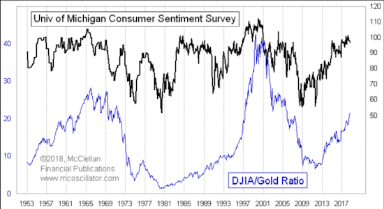

Right now that ratio is up near the upper limits of its range, which implies that it is going to be harder for the DJIA/Gold Ratio to continue higher. For that to happen, consumer sentiment would have to continue to improve, and that is going to be hard to do as there is not much room left for improvement. If the consumer starts to lose confidence in the economy, that is going to show up in the University of Michigan data, and presumably also in the preference for stocks versus gold.
A drop in confidence will lead people to favor “real” assets over hypothetically valued ones like stocks, and so if one is expecting such a change in confidence then gold would be a preferred asset. But just because confidence is high does not mean that it has to drop right away. Confidence remained high throughout the mid to late 1980s, and the DJIA/Gold Ratio kept on rising.
Someday gold will outperform stocks again. The higher that the DJIA/Gold Ratio goes, the more severe that such a prospective gold outperformance will be once this ratio turns down. But the shift does not have to appear right now, just because we are talking about it.
Tom McClellan
Editor, The McClellan Market Report
www.mcoscillator.com
Tom McClellan is the editor of The McClellan Market Report newsletter, and its companion Daily Edition. He is a 1982 graduate of the U.S. Military Academy at West Point, and served 11 years as an Army helicopter pilot before joining his father Sherman McClellan to start their stock market newsletter. Timer Digest ranked Tom as the #1 Long Term Stock Market Timer and #1 Gold Timer for 2017. This article originally appeared September 6, 2018 in Tom’s free Chart In Focus article series. Get more details at their web site, www.mcoscillator.com.
Copyright © 2018
McClellan Financial Publications
All rights reserved.

|